![Full Logo.png]](https://help.devicie.com/hs-fs/hubfs/Full%20Logo.png?height=30&name=Full%20Logo.png)
Overview
This guide outlines the steps to use your organization's logo and custom colour schemes to provide a consistent look-and-feel on your Microsoft Entra (Entra ID) sign-in pages.
These sign-in pages appear when users sign in to your organization's web-based apps, such as Microsoft 365, which uses Microsoft Entra ID as your identity provider, and can reflect the branding we set within this process.
The same company branding also appears on the sign in page when users onboard a device on your company tenant.
Disclaimer
All information sourced in this document is from Microsoft Entra Documentation and can be subject to change.
Requirements
Favicon:
Image size: 32x32px (resizable)
File size: <5KB
Background image:
Image size: 1920x1080px
File size: <300KB
Page background colour:
Hex value for example #FFFFFF
Header logo:
Image size: 245x36px
File size: 10KB
Banner logo:
Image size: 245x36px
File size: 50KB
Square logo image, light theme:
Image size: 240x240px (resizable)
Max file size: 50KB
Square logo image, dark theme:
Image size: 240x240px (resizable)
Max file size: 50KB
Steps
-
Sign in to the Microsoft Entra using a Global administrator account for the directory.
-
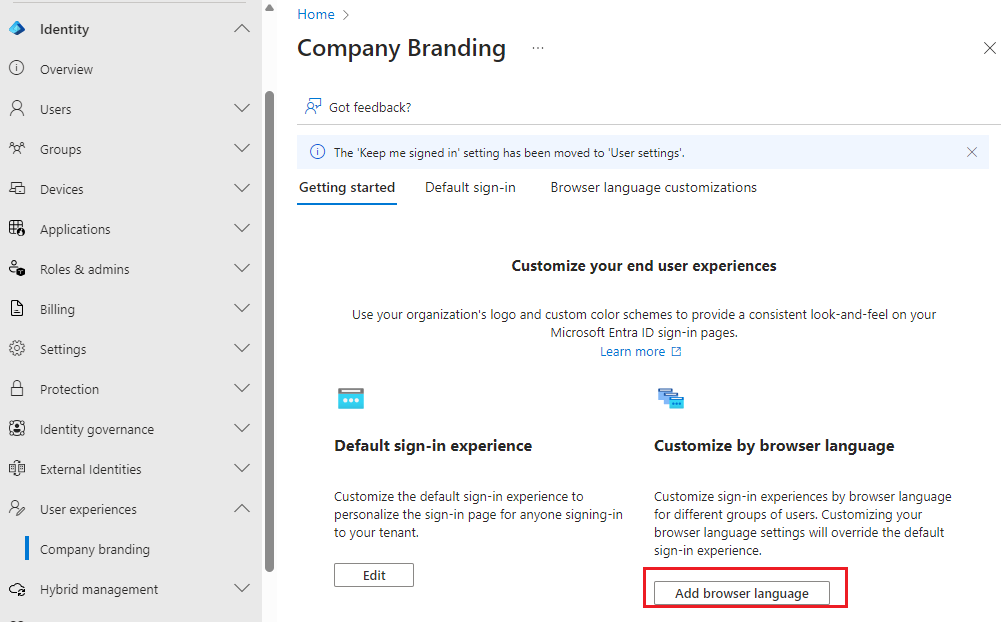
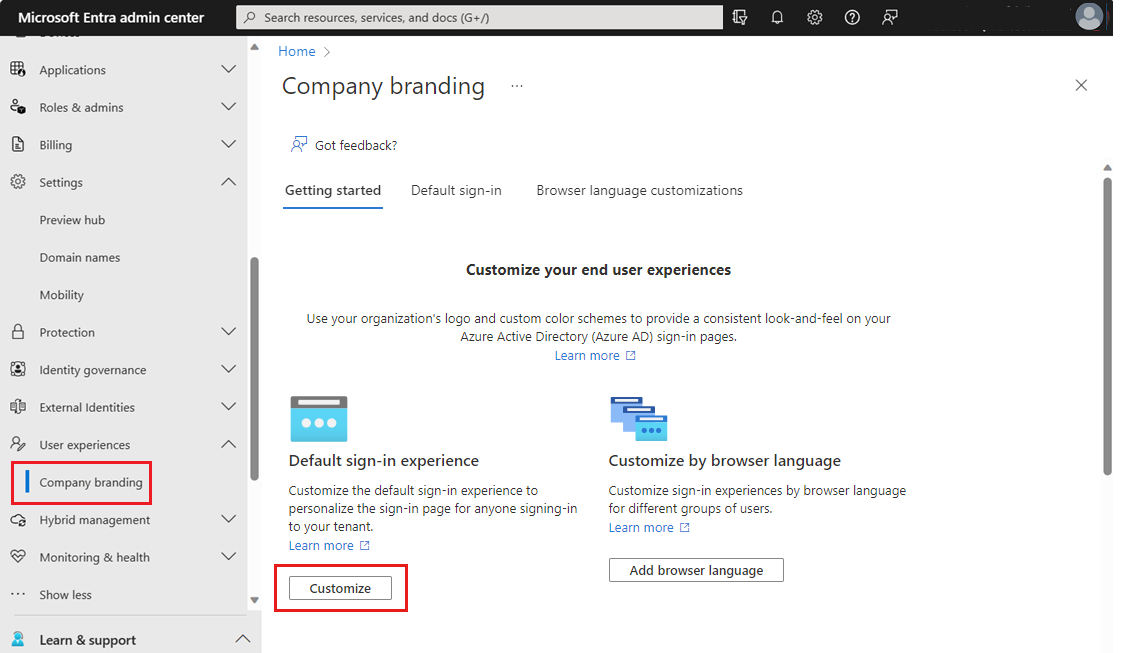
Select Identity, select User experiences and then select Company branding.
-
Under Getting started, select Customise.
-
On the Edit default sign-in experience page, provide any or all of the following information.
Important
All the custom images you add on this page have image size (pixels) and potentially file size (KB) restrictions. Because of these restrictions, you'll most likely need to use an editor to create the correct sized images.-
Basics
-
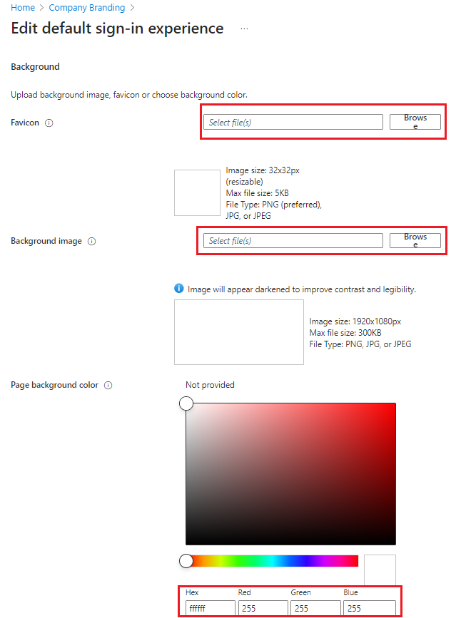
Favicon. Select a .png or .jpg image icon, this will be displayed instead of the Microsoft logo.
-
Background image. Select a .png or .jpg image file to appear as the background for your sign-in pages. The image will be anchored to the center of the browser and will scale to the size of the viewable space. You can't select an image larger than 1920x1080 pixels in size or that has a file size more than 300,000 bytes.
It's recommended to use images without a strong subject focus, e.g., an opaque white box appears in the center of the screen and could cover any part of the image depending on the dimensions of the viewable space.
- Page background colour. Specify the hexadecimal color (for example, white is #FFFFFF) that will appear in place of your background image in low-bandwidth connection situations. We recommend using the primary color of your banner logo or your organization color.
-
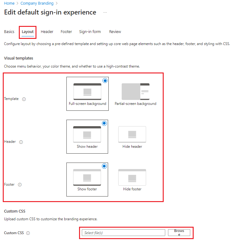
- Layout
- Template. This defines the web page layout either a full-screen background or partial-screen background. A full-screen background could obscure your background image, optional to choose partial-screen background image.
- Header. This defines whether header will appear on the top of the webpage or hide the header.
- Footer. This defines whether footer will appear on the bottom of the webpage or hide the footer.
- Custom CSS. The CSS file replaces Microsoft default styling. This is to manage colour, font, size of the text, how elements are positioned, different displays for different devices and screen sizes. To add a custom CSS template, navigate here. To view a CSS template reference guide, click here.
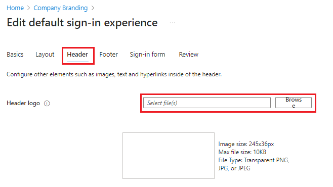
- Header
-
- Header logo. Select a .png or .jpg version the header logo will be displayed in the header of the Microsoft Entra ID sign-in page when users sign-in with an account in this directory.
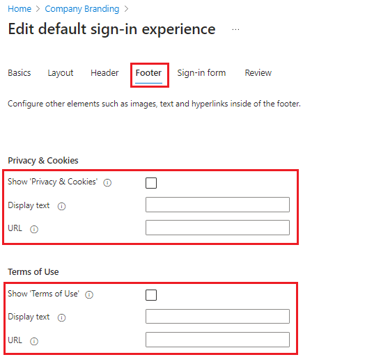
- Footer
-
- Show Privacy & Cookies. This option is selected by default and displays the Microsoft Privacy and Cookies link. This hyperlink will display in the footer section of the Microsoft Entra ID sign-in page when users sign-in with an account in this directory. Uncheck this option to hide the default Microsoft link. Optionally enter your own Display text and URL.
- Show Terms of Use. This option is selected by default and displays the Microsoft Terms of Use link. This hyperlink will display in the footer section of the Microsoft Entra ID sign-in page when users sign-in with an account in this directory. Uncheck this option to hide the default Microsoft link. Optionally enter your own Display text and URL.
-
- Sign-in form
-
Banner logo. Select a .png or .jpg version of your logo to appear on the sign-in page after the user enters a username and on the My Apps portal page.
The image can't be taller than 60 pixels or wider than 280 pixels, and the file shouldn’t be larger than 10KB. We recommend using a transparent image since the background might not match your logo background. We also recommend not adding padding around the image or it might make your logo look small.
-
Square logo image, light theme. Select a .png (preferred) or .jpg image of your organization's logo to appear to users during the setup process for new Windows 10 and Windows 11 Enterprise devices. This image is only used for Windows authentication and appears only on tenants that are using Windows Autopilot for deployment or for password entry pages in other Windows 10 and Windows 11 experiences. In some cases, it may also appear in the consent dialog.
The image can't be larger than 240x240 pixels in size and must have a file size of less than 10 KB. We recommend using a transparent image since the background might not match your logo background. We also recommend not adding padding around the image or it might make your logo look small.
-
Square logo image, dark theme. Same as the square logo image above. This logo image takes the place of the square logo image when used with a dark background, such as with Windows 10 Entra ID joined screens during the out-of-box experience (OOBE). If your logo looks good on white, dark blue, and black backgrounds, you don't need to add this image.
Important
Transparent logos are supported with the square logo image. However, the color palette used in the transparent logo could conflict with backgrounds (such as, white, light grey, dark grey, and black backgrounds) used within Microsoft 365 apps and services that consume the square logo image. Solid color backgrounds may need to be used to ensure the square image logo is rendered correctly in all situations.
-
Username hint. Type the hint text that appears to users if they forget their username. This text must be Unicode, without links or code, and can't exceed 64 characters. If guests sign in to your app, we suggest not adding this hint.
-
Sign-in page text. Type the text that appears on the bottom of the sign-in page. You can use this text to communicate additional information, such as the phone number to your help desk or a legal statement. This text must be Unicode and not exceed 1024 characters.
You can customize the sign-in page text you entered. To begin a new paragraph, use the enter key twice. You can also change text formatting to include bold, italics, an underline or clickable link. Use the following syntax to add formatting to text:
Hyperlink:
[text](link)Bold:
**text**or__text__Italics:
*text*or_text_Underline:
++text++Important
Hyperlinks that are added with sign-in page text render as text in native environments, like in desktop and mobile applications. -
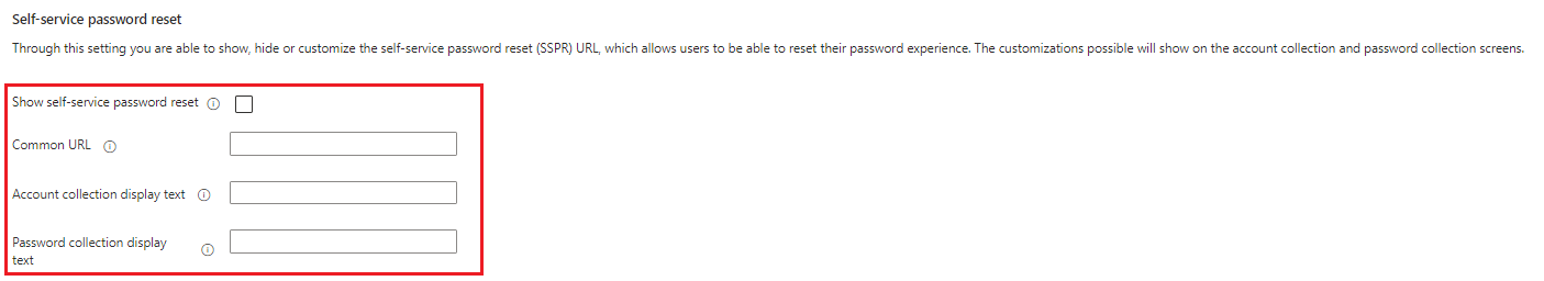
Show self-service password reset. Select the checkbox to turn on SSPR. This displays the 'self-service password reset' hyperlink in the username collection and password screens of Microsoft Entra ID sign-in page when users sign-in with an account in this directory.
- Common URL. Enter a destination URL of the 'self-service password' for where users will reset their passwords. Once configured, this will replace the Microsoft default value.
- Account collection display text. This replaces the default text with your own custom username collection text.
- Password collection display text. This replaces the default text with your own customer password collection text.
-
- Header logo. Select a .png or .jpg version the header logo will be displayed in the header of the Microsoft Entra ID sign-in page when users sign-in with an account in this directory.
-
- Review
-
Review. All of the available options appear in one list which can be reviewed that has been customised or left as the default setting. After you've finished adding your branding, select Create.
If this process creates your first custom branding configuration, it becomes the default for your tenant. If you have additional configurations, you'll be able to choose your default configuration.
Important
To add more corporate branding configurations to your tenant, you must choose Add browser language on the Company branding page. This opens the Browser language customisations where you can follow the same steps as above.
-
-
Important
All the custom images you add on this page have image size (pixels) and potentially file size (KB) restrictions. Because of these restrictions, you'll most likely need to use an editor to create the correct sized images.
Important
Transparent logos are supported with the square logo image. However, the color palette used in the transparent logo could conflict with backgrounds (such as, white, light grey, dark grey, and black backgrounds) used within Microsoft 365 apps and services that consume the square logo image. Solid color backgrounds may need to be used to ensure the square image logo is rendered correctly in all situations.
Important
Hyperlinks that are added with sign-in page text render as text in native environments, like in desktop and mobile applications.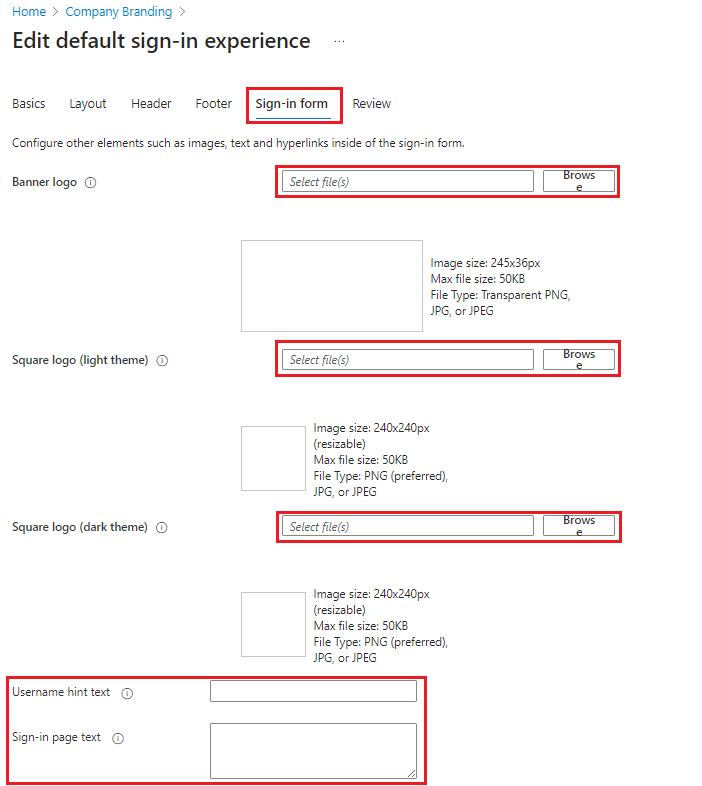
Important
To add more corporate branding configurations to your tenant, you must choose Add browser language on the Company branding page. This opens the Browser language customisations where you can follow the same steps as above.